Gantt Chart Display
Gantt chart text, color and grouping options can be found under Settings > Display Settings
You can select text (attributes), dates, durations, asset count (for grouped views) to customize the Gantt view.

Asset vs grouped view:
The Gantt chart boxes can be viewed by individual asset or consolidated by group, the group being tied to the grouping chosen for each activity of the asset template.
A typical grouping would be by Pad name.
You can toggle this option under Activity Groups, or bye using the hot key Ctrl + G while in the Gantt chart.
You'll see that depending on the activity group setting, different options are available for display.
For example:
when viewed by asset, you can display attributes
when grouped, you can display asset count and group duration

Date range controls the time period that can be visible in the Gantt chart.
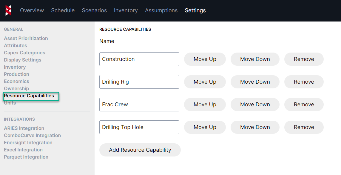
You can control order of resource types under Settings > Resource Capabilities
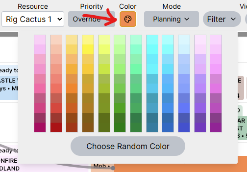
We know colors are extremely important to visualizing and understanding your schedules, so we've included a color palette if you'd like to choose certain colors for activities/groups. You can access this from the schedule view under the color pallet icon.